In the tradition of slow correspondence, the color of a wax seal is a silent prologue. Before a single word is read, the hue sets the emotional tone, signaling the intent of the sender and the nature of the message within.
Using the colors from your collection, here is the "hidden language" of the seal:
Historically, red was the universal standard for official business.

Red: The classic marker of urgency, power, and formal protocol.
Dark Red & Maroon: These represent a more refined, "Old World" status—often used for deep family matters or high-stakes correspondence.
Burgundy: A color of sophistication and luxury, signaling that the contents are of a mature and serious nature.

Black: The historical messenger of mourning. In modern use, it represents bold mystery and a refusal to follow the crowd.
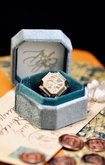
Midnight Blue & Indigo: These were the "professional" alternatives to black, signifying deep sincerity, trust, and a well-considered perspective.
Brown: A grounded, humble color that signals reliability and a lack of pretense.

Forest & Eden: These deep tones represent the "Earth" seals, traditionally used for matters of land, legacy, and long-standing stability.
Sage & Moss: These muted shades align with a more organic, artisanal philosophy. They represent growth, peace, and a quiet connection to the natural world.
Emerald: A vibrant sign of prosperity and vitality.

Steel Blue & Gray Blue: Historically, blue signaled "constancy." These steely tones represent a friendship that is steady, loyal, and unshakeable.
Frosty Blue & Powder Blue: These lean into a sense of unburdened beauty. They represent a lightness of spirit, clarity of thought, and an open, airy communication style.
Teal & Peacock: Creative and soulful, these colors suggest a message that is both artistic and thoughtful.

Cream & Pearl: The traditional choice for weddings and new beginnings. Pearl adds an ethereal shimmer, while Cream offers a warm, "pure" welcome.
Translucent: A modern symbol of transparency. It allows the paper beneath to stay visible, suggesting honesty and a "nothing to hide" approach.
Silver: A cool, lunar color associated with intuition and the subconscious—perfect for sharing dreams or reflections.

Antique Gold & Bronze: These suggest that the letter itself is a physical treasure. Antique Gold feels storied and wise, while Bronze and Copper reflect the beauty of manual work and the heat of creation.
Antique Brass: A weathered, "lived-in" metallic that honors history and the passage of time.

Beyond history, colors are a reflection of the creative soul and the current "inner weather" of the artist.
Sea Mist & Mountain Mist: These colors match a mood of quiet reflection. They are the shades of a "flow state," perfect for sealing a diary entry or a collage that explores the subconscious.
Dusty Pink & Wisteria: These soft, dreamy tones evoke a "romantic-creative" vibe. They are best paired with manual crafts like knitting or delicate paper art, where the beauty is subtle and unhurried.
Matcha & Honeydew: These "fresh" colors signal a breakthrough or a new artistic spark. They are the colors of a morning spent creating for the sake of creation.
Eggplant & Purple: The colors of the "visionary." Choose these when your work feels bold, spiritual, or deeply connected to a complex internal narrative.
Ultimately, a wax seal is more than a closure; it is a moment of pause. Choosing a color like Sea Mist or Antique Gold isn't just about matching an envelope—it’s about choosing how your recipient first feels your message. When you press your stamp into the wax, you aren't just sealing a letter; you are preserving a piece of time, transforming a simple piece of mail into an unburdened gift of pure aesthetic joy.